
-
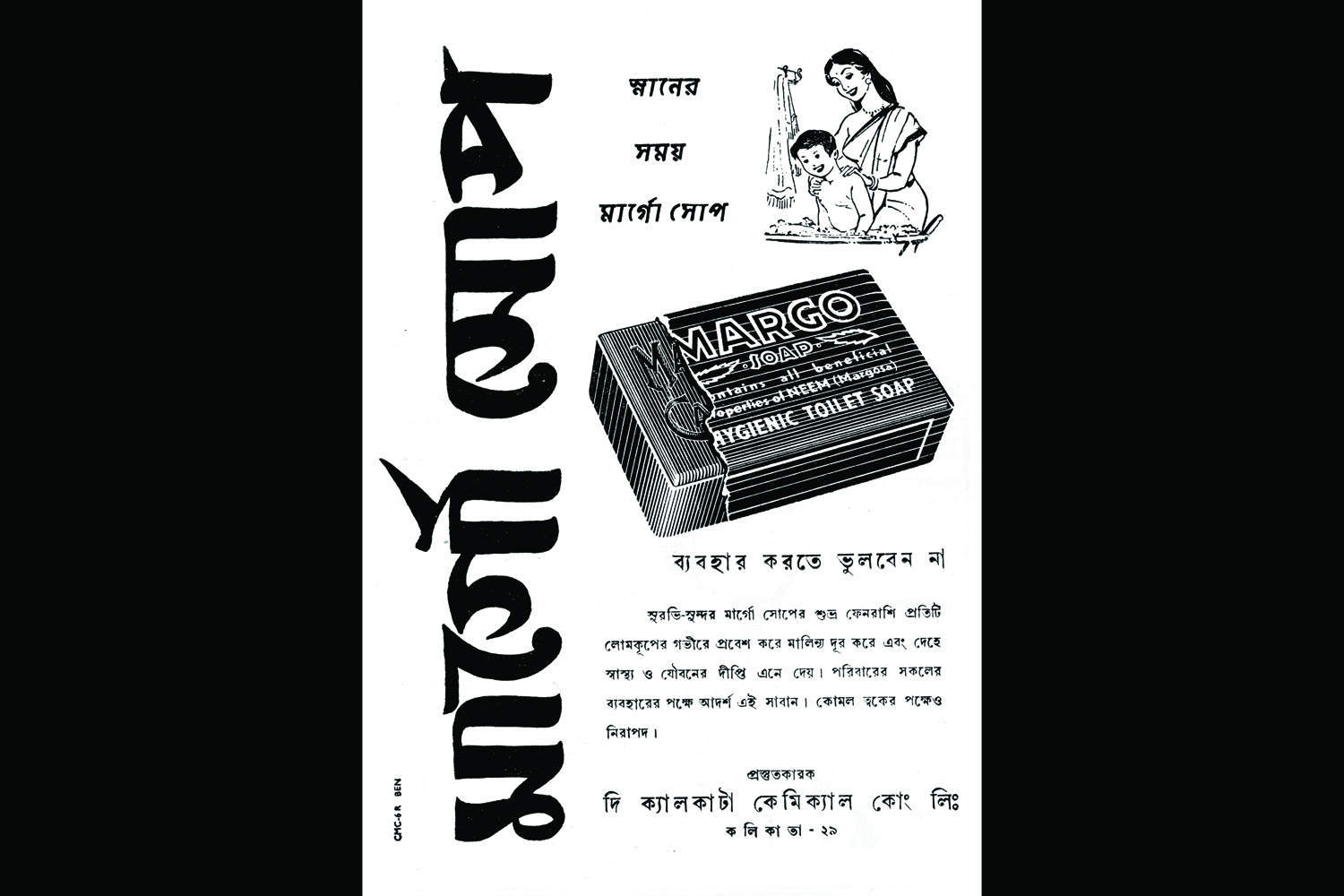
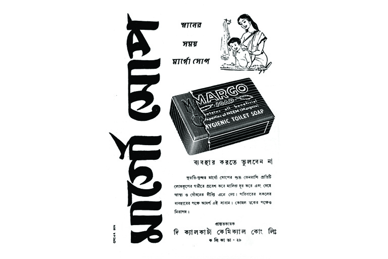 Satyajit Ray's design of the logo for Margo soap.
 -
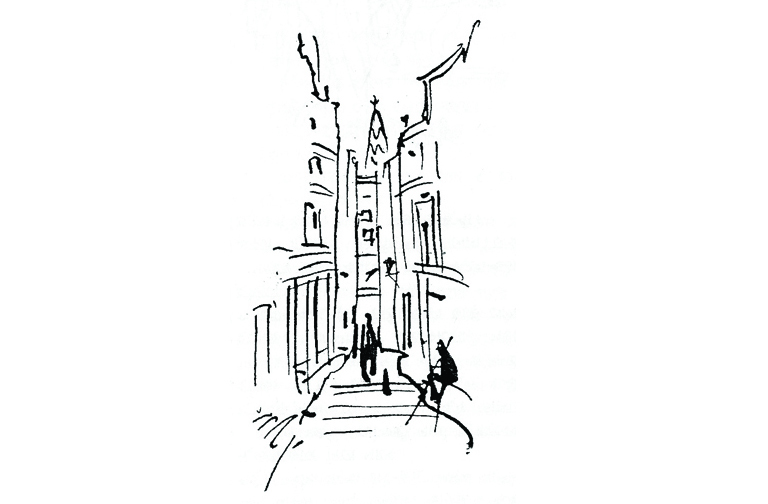 Illustration accompanying a piece, 'Baranasir Diary', which Ray wrote, about shooting Aparajito in Varanasi, for the Bengali literary newsletter Tukro Katha.
 -
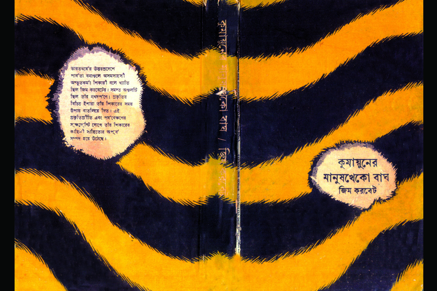
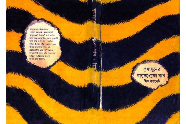 Book cover for the Bengali translation of Jim Corbett's book, Man-Eaters of Kumaon, designed by Ray. The use of the tiger skin is punctuated by the depiction of detailed entry (smaller) and exit (larger) wounds of a bullet.
 -
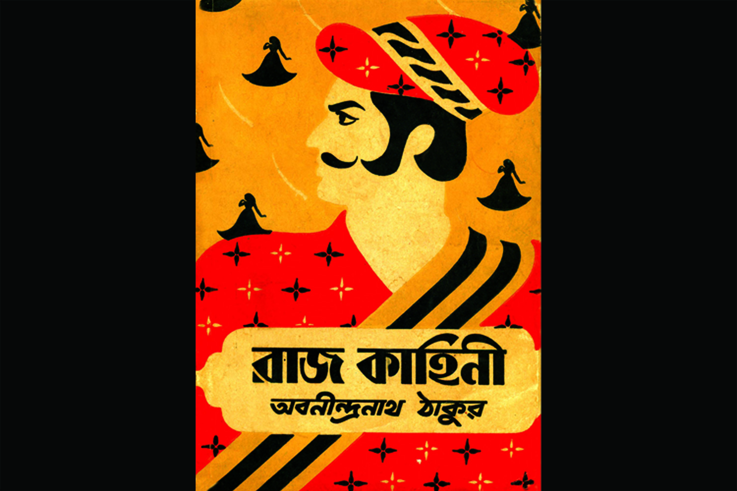
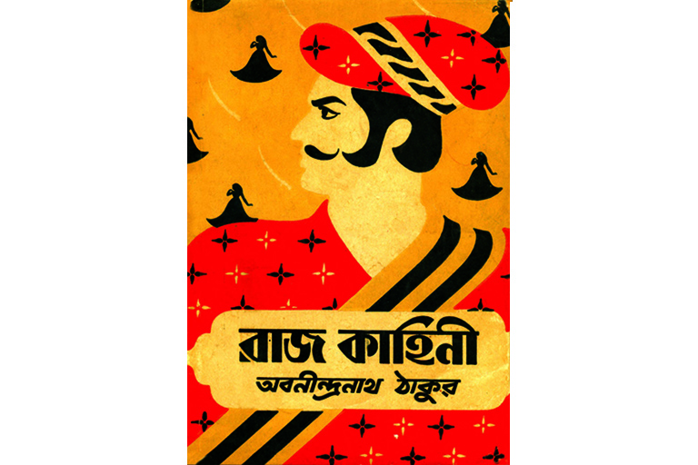 Book cover for Raj Kahini by Abanindranath Tagore, with tales of Rajput warriors. Ray uses elements from classical Indian art, and creates the distinct feel of Indian miniature paintings from Rajputana.
 -
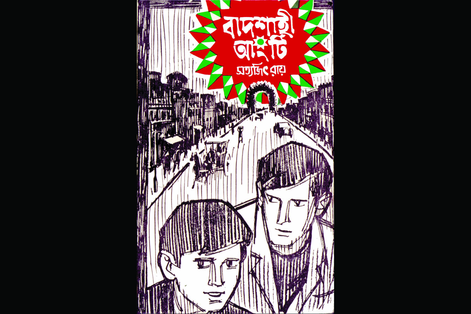
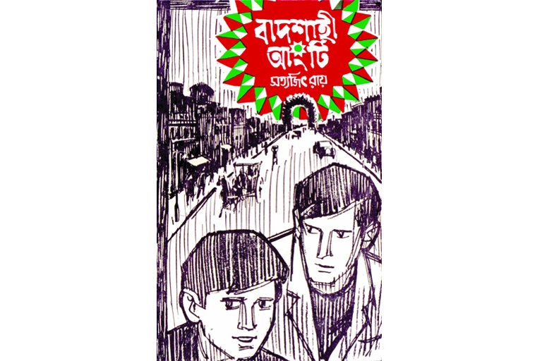 Book cover of Badshahi Angti, written by Ray. The cover features a 'perspective' view of Lucknow, where the story is set, accentuated by the horse-drawn carriage, the motorcar and the row of houses on either side of the road.
 -
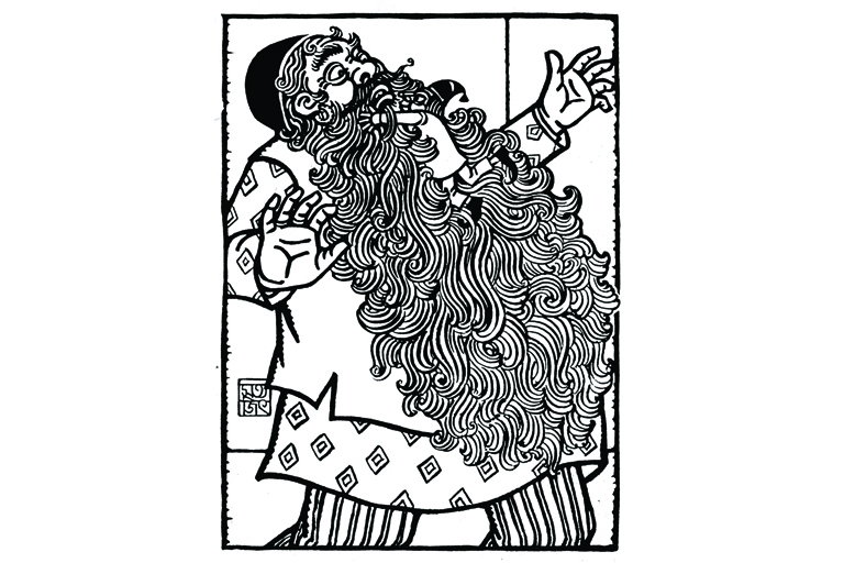 Illustration for Priyamvada Devi's Bengali story Panchulal. The style draws heavily from the Pat art and wood-cuts of Bengal, especially the thick lines of the Kalighat Pats.
 -
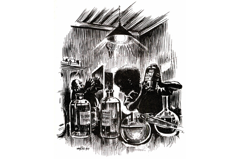 Illustration for the story 'Professor Shonku O Khoka'. A clever exploitation of negative and positive spaces, and the use of very thin lines to depict details.
 -
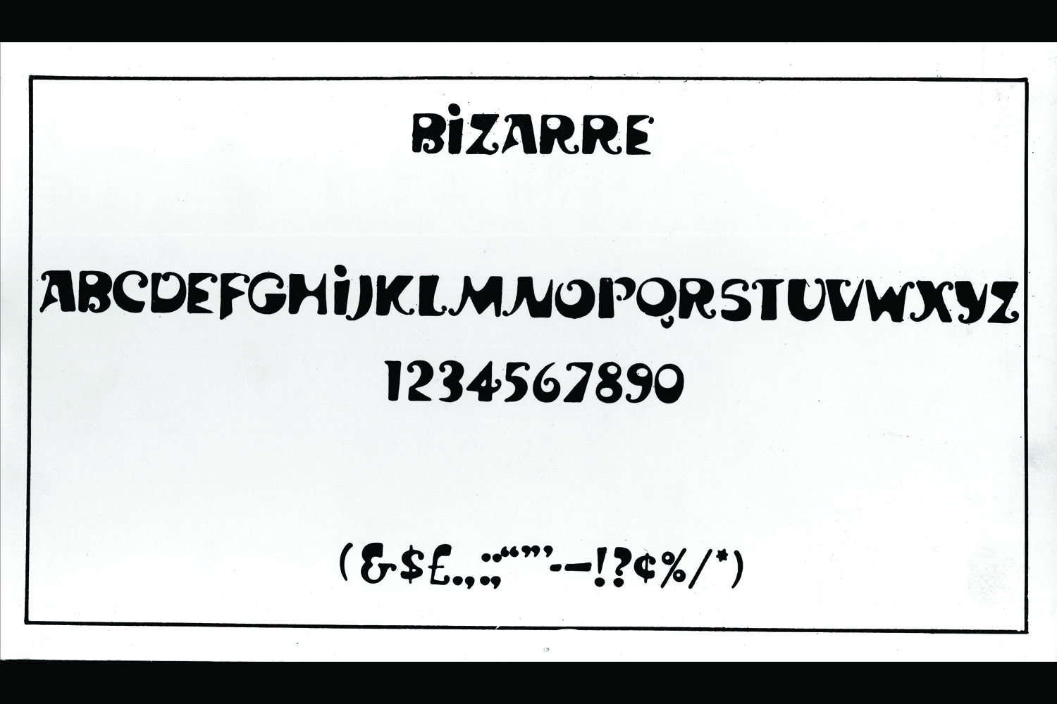
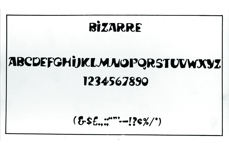 The 'Ray Bizarre', one of the four English typefaces designed by Ray for a type foundry in Florida in the sixties. In spite of regularly experimenting with Bengali letters in logos and posters, Ray never got around to designing a Bengali typeface, something he was keen to do.
 -
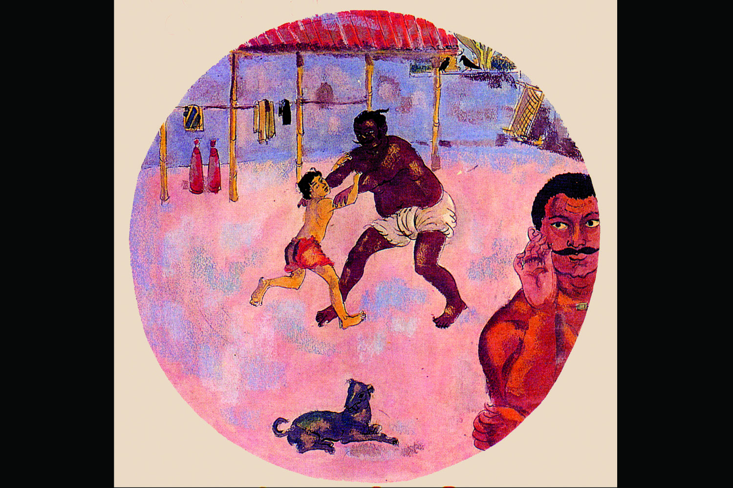
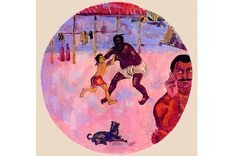 A page from the 1961 Tagore Centenary Year Calendar, sponsored and published by India Tube Ltd. Ray uses visual cues from Tagore's autobiography Jeebon Smriti, to depict the young Tagore learning wrestling. Figures and objects are scaled to represent the way the 'camera-eye' may have seen the scene.
 -
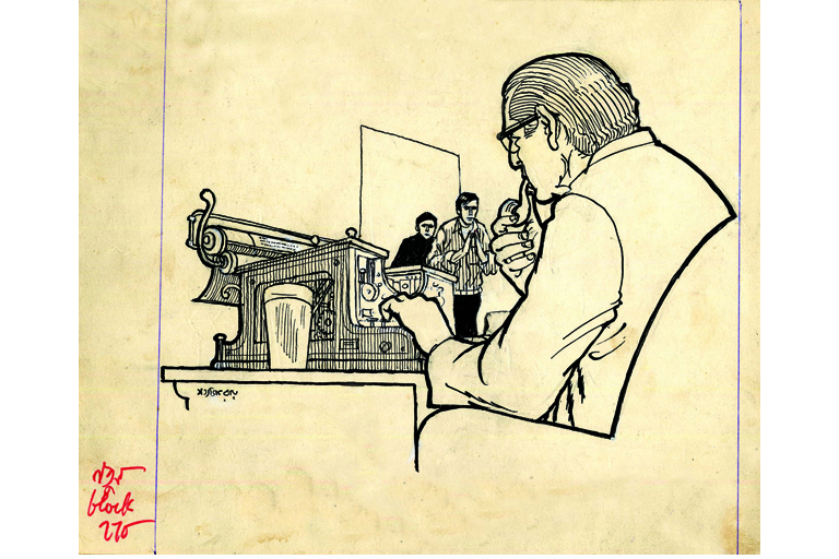 Illustration for Ray's own detective novel, Baksha Rahasya. This is the original illustration published in the Puja issue of Desh magazine, complete with Ray's notes to the block-master in red, in the left corner. Ray skilfully used paper-white and lines of varying thickness to bring out details.
 -
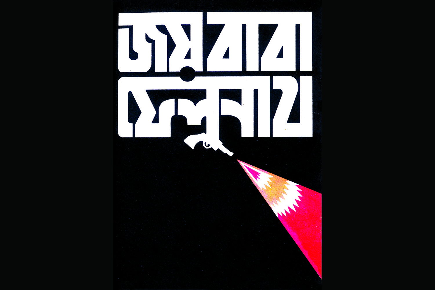
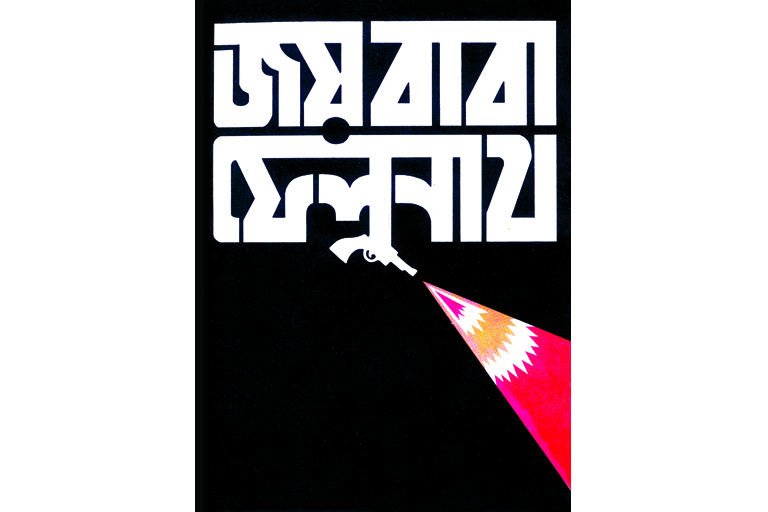 Poster design for his 1979 film, Joi Baba Felunath, a crime-thriller-cum-adventure story. The poster simply features the title, with a firing gun and colors chosen to create a sense of contrast and surprise.
 -
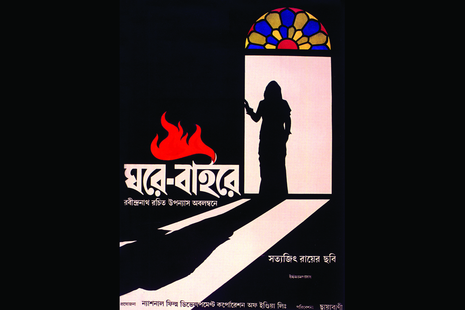
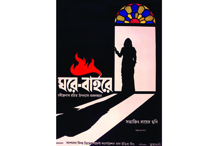 Poster for his 1984 film, Ghare Baire, designed by Ray, and executed/finished by his son Sandip. It depicts the the silhouetted figure of the heroine Bimala, who comes out of the sheltered zenana-mahal to the outside world.
 -
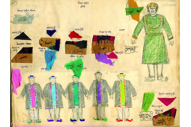 Scan from Ray's Kheror Khata (Red Notebook) showing the detailed costume design for the four ministers and clerk of the Diamond King's court in his 1980 film, Hirak Rajar Deshe. Ray's attention to detail and pre-production was immaculate— attached on the page are fabric and textile swatches to be used for the actual costumes.
-
 Satyajit Ray's design of the logo for Margo soap.
 -
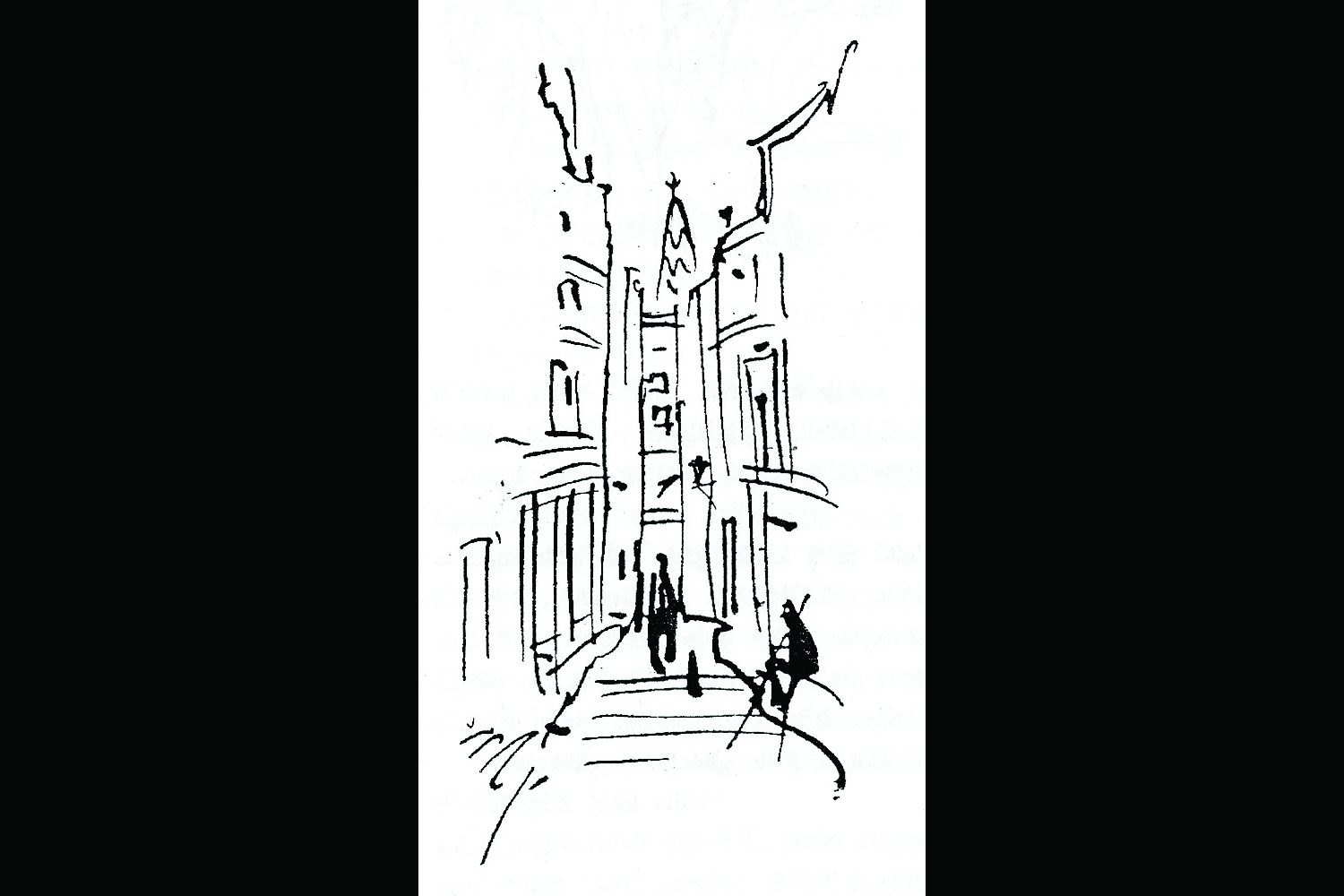 Illustration accompanying a piece, 'Baranasir Diary', which Ray wrote, about shooting Aparajito in Varanasi, for the Bengali literary newsletter Tukro Katha.
 -
 Book cover for the Bengali translation of Jim Corbett's book, Man-Eaters of Kumaon, designed by Ray. The use of the tiger skin is punctuated by the depiction of detailed entry (smaller) and exit (larger) wounds of a bullet.
 -
 Book cover for Raj Kahini by Abanindranath Tagore, with tales of Rajput warriors. Ray uses elements from classical Indian art, and creates the distinct feel of Indian miniature paintings from Rajputana.
 -
 Book cover of Badshahi Angti, written by Ray. The cover features a 'perspective' view of Lucknow, where the story is set, accentuated by the horse-drawn carriage, the motorcar and the row of houses on either side of the road.
 -
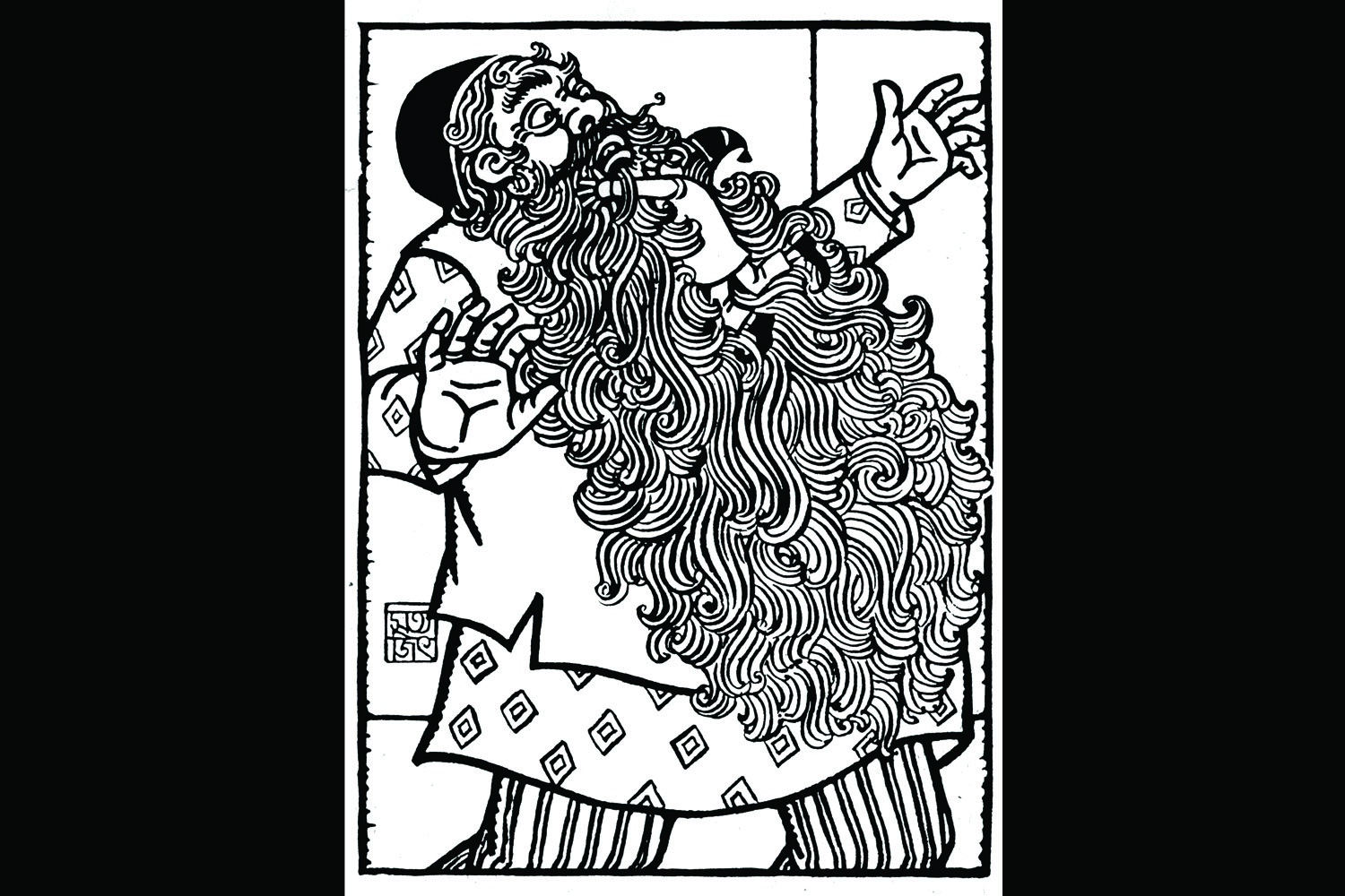 Illustration for Priyamvada Devi's Bengali story Panchulal. The style draws heavily from the Pat art and wood-cuts of Bengal, especially the thick lines of the Kalighat Pats.
 -
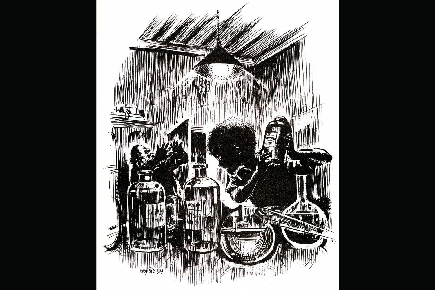 Illustration for the story 'Professor Shonku O Khoka'. A clever exploitation of negative and positive spaces, and the use of very thin lines to depict details.
 -
 The 'Ray Bizarre', one of the four English typefaces designed by Ray for a type foundry in Florida in the sixties. In spite of regularly experimenting with Bengali letters in logos and posters, Ray never got around to designing a Bengali typeface, something he was keen to do.
 -
 A page from the 1961 Tagore Centenary Year Calendar, sponsored and published by India Tube Ltd. Ray uses visual cues from Tagore's autobiography Jeebon Smriti, to depict the young Tagore learning wrestling. Figures and objects are scaled to represent the way the 'camera-eye' may have seen the scene.
 -
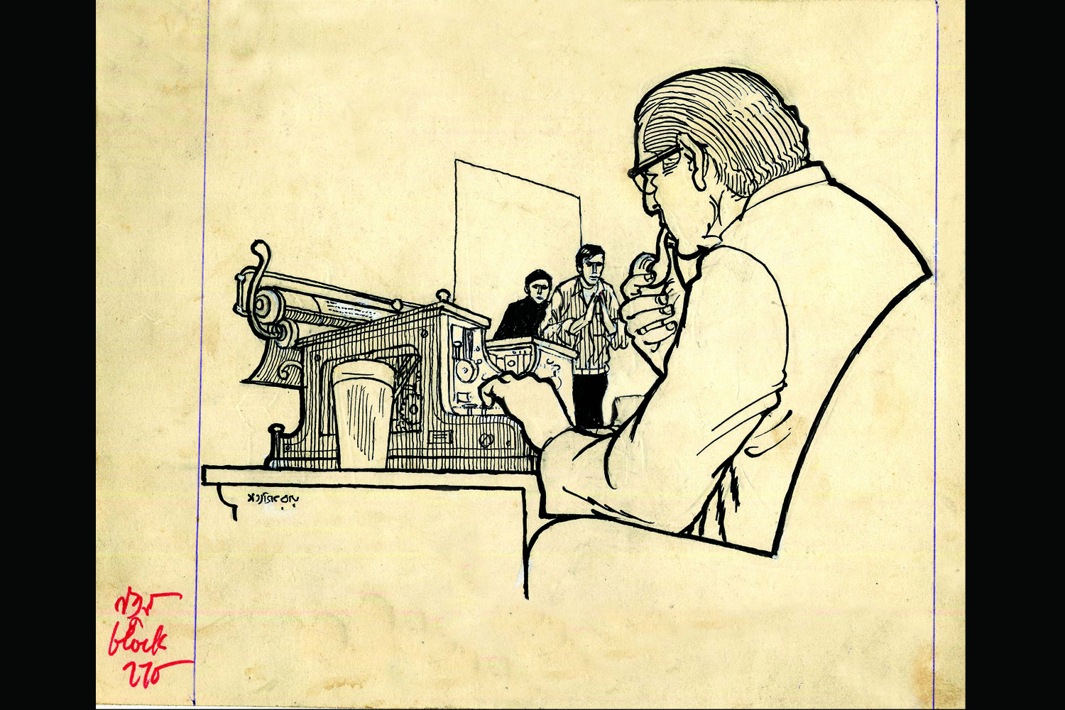 Illustration for Ray's own detective novel, Baksha Rahasya. This is the original illustration published in the Puja issue of Desh magazine, complete with Ray's notes to the block-master in red, in the left corner. Ray skilfully used paper-white and lines of varying thickness to bring out details.
 -
 Poster design for his 1979 film, Joi Baba Felunath, a crime-thriller-cum-adventure story. The poster simply features the title, with a firing gun and colors chosen to create a sense of contrast and surprise.
 -
 Poster for his 1984 film, Ghare Baire, designed by Ray, and executed/finished by his son Sandip. It depicts the the silhouetted figure of the heroine Bimala, who comes out of the sheltered zenana-mahal to the outside world.
 -
 Scan from Ray's Kheror Khata (Red Notebook) showing the detailed costume design for the four ministers and clerk of the Diamond King's court in his 1980 film, Hirak Rajar Deshe. Ray's attention to detail and pre-production was immaculate— attached on the page are fabric and textile swatches to be used for the actual costumes.
Animation filmmaker Jayanti Sen learnt her craft from Satyajit Ray himself. She also edited the first anthology of essays on Ray’s graphic art and authored another more detailed book on the same subject. Here is her curation of 13 of his artworks, along with notes on what they represent.
When I look back and think of why I really undertook the project of authoring a full book on the graphics of Satyajit Ray, what comes to my mind foremost is the fact that, much before this book, I edited and compiled a collection of Bengali and English essays on this subject way back in 1995. That book was released at the opening of the first ever exhibition of Ray’s graphics in Kolkata, curated by Ray’s son—artist and filmmaker Sandip Ray—and coordinated by me, at the Oxford Bookstore Gallery. The driving force behind both ventures was Snehanshu Mukherjee, the architect responsible for the new look—that persists till today—of the Oxford Bookstore Gallery.
That book, a bi-lingual collection—penned by artists such as Paritosh Sen, Raghunath Goswamy, Purnendu Pattrea (then editor of Bengali journal Desh), Sagarmoy Ghosh (then editor of Anandamela, the Bengali children’s magazine), Debashish Bandyopadhyay from the Anandabazar Patrika (one of the most widely read Bengali newspapers) and a host of others—addressed various aspects of Ray’s graphic design aesthetic. The hugely enthusiastic response from readers for this book, titled The Art of Satyajit Ray/ Shilpi Satyajit (Bengali for ‘Satyajit, the Artist’), prompted me to think of a larger and more serious project on the subject. Thus began my journey towards creating Looking Beyond: Graphics of Satyajit Ray. En route, I delivered a lecture-demonstration on Ray’s Graphic Designs, also titled ‘Shilpi Satyajit’, at the Satyajit Ray – Jasimuddin Festival in Dhaka, Bangladesh. The enthusiastic response to that lecture was very encouraging and egged me on towards the completion of this project.
What I have tried to accomplish with this book is to make readers aware of Ray’s own journey, as an artist, from graphic designer to filmmaker. An aspect of Ray’s creativity, which often remains relatively overlooked, is his life and work as an ad-man. I have written in the past on Ray, O.C. Ganguly, Makhan Dutta Gupta, Dr. Ranen Ayan Datta, Raghunath Goswamy— all of whom worked under the great designer Annada Munshi to bring about an essentially Indian element to our advertising creations. Instead of being lame imitations of the West, our advertising created its own niche in the world of graphic art. Such contributions form a very important part of my book.
For a detailed analysis of Ray’s illustrations, book covers, cine posters—all aspects of his graphic design work—I conducted in-depth interviews with Sandip Ray, artist Sibsankar Bhattacharya and O.C. Ganguly, which provided me with valuable material and insight on the hows and whys of Ray’s art.
***
I would now like to refer to some images from my book, displayed here, which will provide us with visual clues to navigate Ray’s vast body of artwork.
It is in my book that a logo design of Margo Soap, taken from the now extinct Bengali art journal Sundaram, has been republished for the first time. Ray was a fantastic calligrapher. He learnt from none other than the great artist Nandalal Bose. Here, Ray used thick brush lines to create this ornate logo.
***
One little known fact is that, while Ray was working as an ad-man at D. J. Keymer and Co., Dilip Kumar Gupta, popularly known as D. K., established the Signet Press in 1943. Books published at the Signet Press marked new milestones in the history of Indian publishing. Ray was one of the principal artists entrusted by D. K. to decorate and design books published by Signet Press. D. K. also explored new territories in culture writing by bringing out a literary newsletter Tukro Katha, in which the then budding litterateurs Premendra Mitra, Sunil Gangopadhyay, Shakti Chattopadhyay, Buddhadeb Basu were written about. Discussions on Bengali literature as a whole, including poetry, was the most salient feature of Tukro Katha. It was in Tukro Katha that Ray wrote about his experience of shooting the film Aparajito, in Benares, or Varanasi, in a piece titled ‘Baranasir Diary’ (a diary from Varanasi). The illustration we see here shows us how dexterously Ray used ‘perspective’ (the technique used to represent a three-dimensional world, which is what the human eye sees normally, on a two dimensional surface) in a lot of his illustrations. Using thin croquil nib, he creates these sensitive lines depicting a scene in Varanasi. He was greatly inspired by the work of the famous photographer Henri Cartier-Bresson. His own cinema influenced his illustrations too. This illustration has a singularly cinematic look about it, if we inspect it closely.
It was, in fact, the art of illustration that led Ray to become a filmmaker in the first place. When D. K. entrusted Ray with the design and illustrations for the abridged version of Bibhutibhushan Bandopadhyay’s famous Bengali novel Pather Panchali, Aam Aantir Bhempu (Pather Panchali was actually published as a trilogy. Aam Aantir Bhempu, or ‘the bugle fashioned out of a mango seed’, was the second in the series), Ray thought of making a film out of the book.
***
The book jacket of the translation of Jim Corbett’s book Man Eaters of Kumaon— Kumayuner Manushkheko Bagh, designed by Ray and published in 1950, is one of my favourite wrap-around book covers. Here he makes novel use of the idea of a tiger’s skin print for book cover. A bullet seems to have entered the book (and the skin) and gone out of its back. The difference in the size of the two holes—the one behind is a larger hole, being torn wider by the bullet (a bullet’s exit hole is always wider than that at the point of entry)—tells us a lot about Ray’s eye for detail. Also, the way he uses the striking colours of the tiger skin and the classic use of space— exploiting the format of a book cover as a ‘whole’ to create a visually arresting design, is remarkable.
***
Ray, as a designer, looked around him to draw inspiration for his art. In the years he spent at Kala Bhavan, Santiniketan, under the guidance of stalwarts like Nandalal Bose, Benode Behari Mukherjee and Ramkinker Baij, he became acquainted with the beauty and sensitivity of classical and modernist Indian art per se. As a student he visited the Ajanta-Ellora caves and the Konark Sun Temple to absorb and assimilate the best of classical Indian art. It is also interesting to note that his companions during these journeys were art scholar Prithwish Neogy, Artist Dinkar Kaushik and the famous Tamil playwright, theatre director and art director Na. Muthuswamy. As Ray himself tells us, Neogy taught him how to ‘look’ at a picture. It is this essentially classical Indian influence that comes to the fore when we look at the book cover of Raj Kahini (The Royal Tale). He uses thick but sensitive brush lines to increase the feel of Indian miniature paintings from Rajputana, or Rajasthan, as Abanindranath Tagore writes about the tales of Rajput warriors in this book. This was a special attribute of not only Ray, but his contemporaries, such as Khaled Chowdhury, Raghunath Goswamy or Ranen Ayan Datta, as well. These artists evoked the essence of a book through its cover design. The reader immediately gets a feel of what he or she is about to encounter on opening a book.
***
Through the book cover of Badshahi Angti (The Emperor’s Ring) designed in the late sixties, Ray introduced us to Feluda, the young detective he created in the line of Arthur Conan Doyle’s Sherlock Holmes. Since this is the first full-length novel in the series to be published in the form of a book (and not episodically in a magazine), Ray keeps the faces of the detective Feluda and his cousin and assistant Topshe in the foreground. The basic facial features of the two had been well illustrated by Ray, and the duo soon made their place in the hearts of children and adults alike through these illustrations as much as for the stories themselves. An interesting feature about this book cover is the way Ray uses perspective to depict the city-profile of Lucknow, where the story is set. We can see how he employs the technique of ‘foreshortening’ (used to create the illusion of an object or objects receding quickly into the distance, or background) for the horse-drawn carriage, the motorcars and the row of houses flanking the two sides of the road. This use of perspective brings to mind Satyajit Ray the still photographer, who had taken an enormous amount of photographs, besides sketching profusely, when he had gone on tours of Ajanta-Ellora or, in his later life, on his trips abroad where he was sent by his advertising firm D.J. Keymer and Co. It should also be known that it was common practice for Ray to create completely new designs and illustrations for his stories when they were published as books. Badshahi Angti was initially serialized in the pages of the children’s magazine Sandesh, for one whole year in 1966, while Ray was editing it. Sandesh, founded by Ray’s grandfather Upendra Kishore Roychowdhury way back in the early 1920s, was practically a family magazine for him. In its second phase Ray’s father Sukumar Ray edited it, but his untimely death led to the magazine’s demise. It was in 1961 that his friend, the poet Subhash Mukhopadhyay, gave Ray the idea of reviving Sandesh.
The point I’m trying to make is, even if Ray had already created and published an illustration to accompany his writing in Sandesh, he could easily take the liberty of changing or modifying it to better suit the pages of the book when the work was published as a whole.
***
Ray also did the illustration for Priyamvada Devi’s Bengali story Panchulal. This is a very interesting work. Panchulal is based on the famous children’s story Pinocchio. For this sketch Ray draws liberally from the pat art and wood-cuts of Bengal. He uses thick brush lines reminiscent of the Kalighat pats. What I really love in this illustration is the exaggerated beard of the old man, drawn in the fashion of an animation still, and Panchulal climbing the beard to reach the old man. The difference in the scale and size of the man and the little Panchulal is another interesting touch. In fact Ray was an avid enthusiast of animation art. He encouraged me often to go to the National Institute of Design, Ahmedabad, to learn animation. So this particular illustration I always see with an animator’s eye, and I love it for the extremely beautiful brush strokes Ray uses to Indianize the foreign tale of Pinocchio, rooting it in Indian artistic traditions. Also, Ray uses here the style of drawing used by another great artist of his time, Makhan Dutta Gupta, though he also breaks away from his style in some places.
***
Another famous Ray creation, which all his fans are very fond of, is the scientist Professor Shonku. When creating the character of Professor Shonku, Ray took cues from his own study of the sciences, and science fiction written throughout the world. But he used his own imagination finally to create a peculiar and very original fantasy. The elements that make up Professor Shonku are as fantastical as they are laced with humour. The stories lead to discoveries such as the ‘Anaihilin Pistol’ (that you can use to make someone you’re not pleased about having around just disappear), or a device to capture ghosts, or a time-machine. In this particular image, an illustration for the story Professor Shonku O Khoka (Professor Shonku and the Little Boy) what is most exciting is the wonderful interplay of light and shade. The filmmaker and cinematographer (he often handled his own camera) in Ray shows itself here. The story is about a child who is suddenly transformed into a highly knowledgeable person, uttering great scientific theories. In this illustration Ray uses very thin, lovely lines on paper-white to create the features of both Professor Shonku and the boy. The exquisite effect that we see in this illustration, due to its exploiting of both negative (the space around the subjects of the image) and positive space (the space used up by the subjects themselves), marks it as one of Ray’s best illustrations. Another point which I feel should be made about this illustration is the cinematic point-of-view we see here. The filmmaker Ray seems dominant within the sub-conscious (or was it consciously done?) of the illustrator Ray.
***
Among other artistic creations, Ray also undertook the task of designing new typefaces in English. In the sixties a type foundry in Florida requested him to design these typefaces for them, one of which of which we see displayed here. He actually designed four typefaces, ‘Ray Roman’, ‘Holiday Script’, ‘Daphne’ and ‘Ray Bizarre’. Here we see the ‘Ray Bizarre’ typeface. Artist Paritosh Sen has written about how designing a typeface demands not just immaculate design skills but also enormous reserves of patience. The artist/ designer comes to a conclusive design after trying out innumerable options. As I mentioned earlier, Ray honed his calligraphic skills, guided by Nandalal Bose, when he was a student at Kala Bhavan, Santiniketan. And he believed in experimenting widely when designing a letter, or a full logo, for a product or film. This naturally reminds me of the fantastic logos he designed for his own films, such as Nayak or Kanchenjungha or Seemabaddha. Also, the experiment with just three Bengali letters, year after year, for each issue of the Bengali journal Ekshan, edited by Nirmalya Acharya and Soumitra Chattopadhyay. Or the logos he designed for West Bengal’s film complex Nandan,or for Patha Bhavan school. Even the Sandesh title designs could be cited here. Ray had said in an interview (carried in its entirety in Looking Beyond: Graphics of Satyajit Ray) to veteran journalist Nirmal Dhar that if he had the time he would have designed Bengali typefaces too.
***
1961 was the year of Rabindranath Tagore’s Birth Centenary, and Ray designed a lot in this year, including the page from the Tagore Centenary Year Calendar, sponsored and published by India Tube Ltd., that can be seen above. For this picture, Ray put together intriguing visual elements, that he took from Tagore’s autobiography Jeebon Smriti, within a circular image. The young Tagore used to learn wrestling, and so the young boy is shown clinched to a wrestler at the centre of the image. The artist’s eye for detail can be seen in the dog sitting in the foreground or clothes on a clothesline, and dumbbells of sorts, called Mugur in Bengali, painted in the background. This is an important image in Ray’s career as a graphic designer, because it is an image where both the painter and the filmmaker in him emerge, almost as one. The way he uses flowing lines to outline his figures, and his figure-drawing (the drawing of the human form) in general, is very accomplished. Also, seen as a whole, it has a cinematic quality to it: the scale and the size of each object and person, as he has painted them, varies, as the camera-eye, or the Kino-Eye, may have seen the scene. The dynamism of the imagery, a moment of movement frozen for eternity, would appeal, again, especially to an animator, and so it does to me. The image reminds one of his documentary film on Rabindranath Tagore which he had made in the same year.
***
The illustration for Baksha Rahasya (The Mystery of the Box), also a detective novel in the Feluda series, is yet another example of how cinematic Ray’s illustrations were. The view of a man typing out a manuscript and the detective duo—Feluda and his assistant and cousin Topshe—smaller in size, in yet another skillful use of foreshortening, creates a great sense of depth within the illustration which seems to have been thought of in terms of seeing the scene through the eyes of the movie camera. Also the typewriter is drawn in wonderful detail, with all its elements etched out clearly. Ray uses thin as well as thick lines of the pen to bring out details such as the man’s hair and the outline of his profile. Another important aspect of this illustration is the way he uses paper white to create an impression of volume, within a human body bound by lines. This illustration is the original, drawn for the Feluda novel Baksha Rahasya published in the Pujo (Durga Puja) Issue of the Bengali magazine Desh, and we can see the instructions given by Ray to the block-maker in red, in the left hand corner. Also notice how he has sketched the folds of the man’s shirt, within the outline of his profile. The artists who Ray learnt from taught him that outlines, by themselves, are dead things. He learnt from his Mastermoshai (teacher) Nandalal Bose how to catch the rhythm of life within the outlines, so the figure comes alive to our mind’s eye via even a line drawing.
***
The poster design created by Ray for the film Joi Baba Felunath (The Elephant God, 1979)—dimensions: 30 by 40 inches—is another interesting example of how he exploited both positive and negative spaces within a format. Here, paper white is the colour of the lettering, with black in the background. Notice the incorporation of a pistol that is being fired within the title-design. Joi Baba Felunath is, once again, a crime-thriller-cum-adventure woven around the detective Feluda. So, to prepare his audience for this visual treat, he brings in just one potent visual element and nothing more. Also fascinating is the use of colour, how he exploits the contrast between black, red and white to demonstrate sparks and the effect of firing a pistol. Yet it gives nothing away of the plot at all, stoking curiosity about what the black space may comprise. The way Ray uses lettering in this poster makes me think of how excellent it would have been if he had designed Bengali type-faces too.
***
One of the books that haunted Ray for years, and which he finally made into a film of the same name in 1984, was Rabindranath Tagore’s novel Ghare Baire (The Home and the World). I was fortunate enough to be present at the shooting of this film, as an observer in his unit, and the experience of seeing the great master at work is unparalleled.
The film is about the heroine Bimala’s (played by Swatilekha Sengupta) coming out of the zenana-mahal to the outside world and her entire experience of falling in love with the revolutionary Sandip (played by Soumitra Chattopadhyay). This is a novel set against the freedom struggle for India’s Independence, especially the violent or ‘terrorist’ segment of it. The poster of the film was designed by Ray and executed and finished by his artist son Sandip Ray. Its dimensions are 30 by 40 inches. The symbolic flames of the freedom struggle, probably felt to be burning throughout the country back when the novel was set, are depicted within the logo where flames form the outline of a Bengali vowel. What appeals to me most is the silhouetted figure of Bimala, and her elongated shadow, against the doorway. Ray epitomizes the ‘coming out’ of Bimala from her world inside the house through this image. What is especially clever is the way Ray uses the stained glass in the arch of the doorway; immediately setting the story in the late-Victorian era, around the period in which Tagore set his story.
***
The costume design by Ray for the four ministers, as well as the Clerk, or Peshkar, of the Diamond King’s Court for the film Hirak Rajar Deshe (Kingdom of Diamonds, 1980) is a very interesting example of how Ray pre-designed almost every visual detail of his film. He has drawn the four ministers’ figures complete with the colour-scheme of their costumes, including their head-gear. Another interesting feature of this visual scanned from his own kheror khata, or red notebook, is that he had attached fabric or textile pieces to be used for the actual costumes, so that the person making the costumes would have an idea of exactly what Ray had in mind when he designed them. This is also telling of what Ray could achieve when he did colour illustrations. They are his ‘film graphics’, in a way, and give us a clear picture of what the characters in the final film will look like.
***
The entire task of creating this book has enriched the visual designer and animator in me, creating a sense of what graphic design can be at its best, when executed by a true maestro.
I see this book as a homage to a maestro I have seen and exchanged words and ideas with very closely over the last ten years of his life. One hopes too that the book, with many more images, including works by great masters like Nandalal Bose and Annada Munshi, besides those by Ray himself, will be a feast for the eyes— a visual treat.
Images excerpted from Looking Beyond: Graphics of Satyajit Ray by Jayanti Sen, courtesy of Roli Books. You can purchase the book here
Shilpi Satyajit
SpecialAugust 2013
 By Jayanti Sen
Jayanti Sen is an author, journalist and filmmaker based out of Kolkata. She began her foray into filmmaking as a member of Satyajit Ray's film unit. Later she trained at the National Institute of Design, Ahmedabad. She has directed several animation films, some of which have travelled to prominent festivals abroad. Before authoring Looking Beyond: Graphics of Satyajit Ray she had edited Art Of Satyajit Ray, an anthology of essays, the first ever book on Ray's graphic design. She has written extensively on cinema and culture, in Bengali and English, for regional, national and international publications.


